
Monday, November 4, 2013
So long!
Thanks for all the support on my blog, I truly appreciate every comment. However, in the interests of trying to post more, work more, and simplify my life, I'll be making any new posts about my work on my tumblr. I hope you'll join me there! http://kalidraws.tumblr.com/
Tuesday, August 20, 2013
Omoide Yokocho


Omoide Yokocho (otherwise known as "Memory Lane" or "Piss Alley") for Light Grey Art Lab's In Place show. Buy a print here!
Omoide Yokocho is a series of slim, cramped alleyways in Shinjuku, packed with yakitori stalls that can only fit 5-10 people at a time and salarymen looking for a drink after work. It's basically a timecapsule from post-war 1950's Japan, and it looks like an amazing place to visit. A lotta work & reference, but one of my favorite pieces I've done. Take a quick walk through via youtube, here! And thanks to Irene Koh for double-checking all my japanese signage!
Can you spot the cat? :3
Thursday, July 25, 2013
7 Deadly Sins
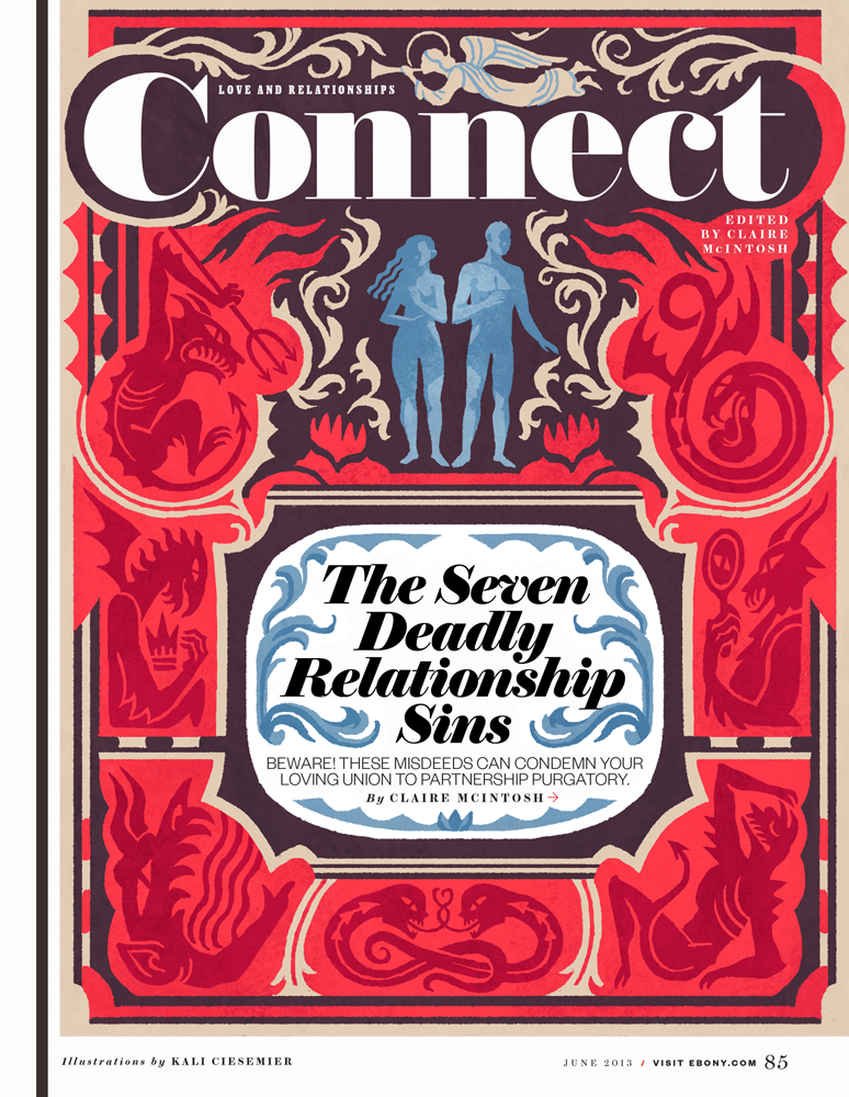


These pieces are from the June issue of Ebony, about the 7 deadly sins in relationships. Thanks to my awesome AD Lynn Galloway, who saw my Mothers Superior illustrations and requested illos that incorporated text similarly. I had a fantastic time working on these modern-y illuminated manuscripts!
I thought of “Adam & Eve being tempted" as a general theme, but was asked to tiptoe around any direct religious connotation. It was a good challenge to try and figure out decorative shapes & images that hearken to ye olde manuscripts, but also ‘feel’ right for the mood of the sins. (Also, have you looked up medieval demons? These dudes are the dooooofiest!)
If anyone needs any more illuminated manuscripts, lemme at ‘em!
Thursday, June 20, 2013
SPACE! The Gallery Show!

My piece for Mike Mitchell's SPACE! The Gallery Show, opening this friday at Gallery 1988 in LA! (with a ton of other amazing artists, oh man!)

I'm a lifelong sci-fi fan, and when I was deciding what to contribute to the SPACE! show I thought of my more memorable sci-fi experiences. Watching Silent Running with my dad as a kid both fascinated and terrified me, and I've been interested in how nature fits into a space travel ever since. What are the logistics of putting something so beautiful and complicated into a very fragile & isolated location?
In the 1970's, NASA, with the help of Dr. Gerard K. O'Neill, studied a variety of plans for space colony designs. I think it's notable that there was a lot of awesome original art created for these plans to inspire people and generate interest in space travel. It's amazing that these same designs have also informed so many modern day depictions of space stations in books, tv and movies!
In the spirit of those NASA illustrations (and after doing a silly amount of additional research) I made a travel poster for a new ecological space habitat of my own design!
Shoutout to Sam for inspiring me to use Google Sketchup....I've been watching him use it very effectively to make simple environment/perspective reference and decided to take the plunge myself. No way in hell I'd be patient enough to draw an inverted curved perspective otherwise!
Some of my preliminary process steps:


Tuesday, June 11, 2013
Summer Vacations...
...aren't always the most relaxing. I was asked to illustrate an essay in Boston Globe magazine written by an author who prefers to just stay HOME during the summer and let everyone else clog up the roads and sweat out in the heat.
My AD suggested an uncomfortable roadtrip, and I thought that adding a glimpse of the cool and relaxing house she's leaving behind would be a nice contrast. (as a homebody at heart, I sympathize)

I myself will be moving apartments not once but TWICE this summer--in two different states no less--so I'm getting geared up for my own "uncomfortable roadtrip" haha. But! I'll be living it up in Brooklyn at the end of it, so here's to some future summer fun!
Thanks again to my AD Ryan Huddle!
Tuesday, May 14, 2013
Editorial Grab-bag!
In between a few longer-term projects I've worked on recently, I've had a bundle of editorial pieces from various times this year that I've been slow in sharing. So here they are now!!!
Family Circle-- An illustration for a personal essay about a teachable moment that happened in a grocery store check-out lane.
Boston Globe-- For a personal essay about beer snobbery--craft beer enthusiasts are often labeled as snobs, but the people who exclusively drink Coors or Bud Light are just another kind of snob too!
The New York Times--A quick illustration for the Preoccupation column. The article was about the clash between older management and young college grads--the younger generation is having a hard time finding employment because many CEOs are skeptical of their workplace value.
Thanks to my ADs Amanda Kirk, Ryan Huddle, and Minh Uong!
Family Circle-- An illustration for a personal essay about a teachable moment that happened in a grocery store check-out lane.
 |
| Sketches |
 |
| Final |
Boston Globe-- For a personal essay about beer snobbery--craft beer enthusiasts are often labeled as snobs, but the people who exclusively drink Coors or Bud Light are just another kind of snob too!
 |
| Sketches |
 |
| Final |
The New York Times--A quick illustration for the Preoccupation column. The article was about the clash between older management and young college grads--the younger generation is having a hard time finding employment because many CEOs are skeptical of their workplace value.
 |
| Sketches |
 |
| Final |
Thanks to my ADs Amanda Kirk, Ryan Huddle, and Minh Uong!
Thursday, April 11, 2013
Ivy League Confidential
Here's a quickie illustration for today's New York Times Letters section! (it's less than 2.5 in tall in print! Eee, so cute) You can find the letters & my piece online as well!

The letters are all in response to the Op-Ed article "The Secrets of Princeton", which argues that the social connections that happen in elite universities are far more important to the graduates' success and privileged standing than is generally acknowledged. "It's not what you know, but who you know"
My ivy-centric sketches:
 Thanks to my AD Alexandra Zsigmond for the chance to draw some secrets!!
The letters are all in response to the Op-Ed article "The Secrets of Princeton", which argues that the social connections that happen in elite universities are far more important to the graduates' success and privileged standing than is generally acknowledged. "It's not what you know, but who you know"
My ivy-centric sketches:
Subscribe to:
Posts (Atom)